The 2016 Redesign
With the first real post, you’ll have to bear with some meta. While setting the foundations of the blog, I also did quite a lot of redesigning with the site, both development and content wise. Here’s what happened.
In the beginning of December I realized that the site has been live for almost half a year. During the time the content and appearance of the site has seen little change. The biggest reason for this is that the site was built on hand-written static markup which means that updating content was as much closing HTML-tags and copy-pasting as it was designing and writing something new. The hand-written stuff did its job for starters but it was now time to move forward.
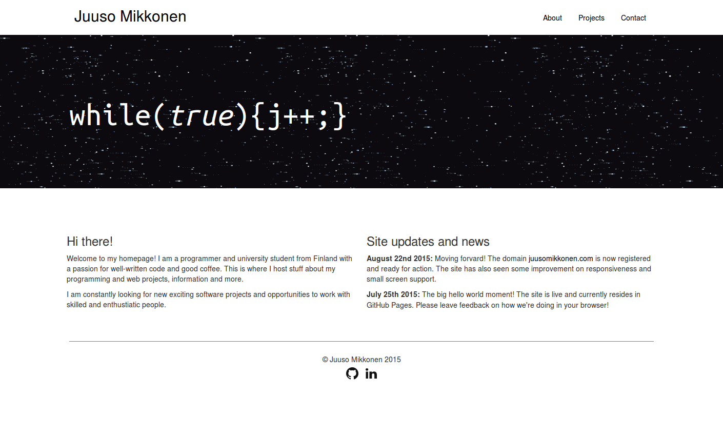 The site back in 2015. Oh so retro!
I still feel that serving static files is the superior method for my site so WordPress and the like were a no-go. At this point, it was just a matter of choosing the right static site generator. I decided to go with Jekyll (over alternatives such as Hugo and Pelican) mostly because all the things I’ve heard from people publishing stuff with Jekyll have been very positive. The GitHub pages integration is also a plus. Also, you can’t go too wrong by betting on the biggest player (at least when it comes to open source).
Getting the existing site on Jekyll was as smooth as you’d expect. The reason why the process took me almost a month in total was (besides procrastination) that I also did some heavy changes and added features that took some effort - like writing a sort of a plugin. The plugin is still under development and I’ll be writing about it once I manage to get a few problems resolved.
As a byproduct of the migration, I managed to get rid of Bootstrap CSS framework shaping the way the site is presented. Just like writing the site manually, Bootstrap was also good for getting the site up and running fast but at this point it stated to feel like the framework wasn’t bringing any extra value to the development or to the site in general. To replace it I wrote my own minimal container and grid system in SCSS and realized that containers and grids were pretty much the only thing where I truly was dependending on Bootstrap.
The biggest visual change was the landing page jumbotron. I thought about it for quite a long time before ending up with Conway’s Game of Life. I had several criteria and the famous cellular automata seemed to do the best job in filling them. First of all the jumbotron had to get the attention of the viewer. I had used an animated gif before and I liked having some action on the otherwise static site.
Another major criteria for the jumbotron was that it had to actually have something to do with the site. Just some pretty picture - animated or not - would not do the trick. I’ve always been fascinated with cellular automata, especially the Game of Life. To me it represents some weird ideal of computer science. I don’t know what it is about the game but I guess it has something to do with the pretty much complete uselessness and the amount of reserch on the subject regardless of this.
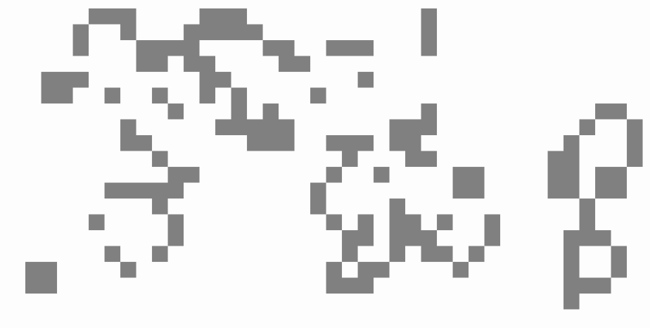 A day in the life
I implemented the game with pure Javascript using the HTML5 canvas element. The implementation was nothing special, the problem is quite an easy one and I have actually written the very same in plain C in university. The one thing that I expected to be a problem - but which actually turned out to be trivial - was making the game responsive. I had no idea that the canvas element would scale so smoothly! Simply setting the width and height of the element worked like charm.
Other than that the visuals of the site have remained mostly the same. The blog part obviously required some extra styling as the posts utilize elements that I haven’t needed so far, such as code blocks. I plan to do some polishing on that area once I have some more content out and have a better picture on what I want visually. The styling has been a lot more convenient with preprocessed CSS and no underlying style definitions to overwrite (I got rid of most of the CSS that came with Jekyll).
In the end I’m quite pleased with the result. I like the minimal approach I took with it and by minimal I don’t mean just that the styles are simple and clean - I also managed to get the page sizes down quite a bit. If there’s one thing I dislike it’s sites that present you a “minimal design” while loading megabytes after megabytes of assets in the background and running scripts like crazy.
As I noted before, the development of the site will continue steadily and new posts should start dropping whenever I have something cool to write about. I’d really appreciate all feedback on the blog and the site in general. I didn’t include a comment box in the posts yet but you’ll find ways to contact me under the contact tab of the site. I’m also thinking of rolling back my long-forgotten Twitter account as a more instant channel for feedback and comments.